/
Diin
Diin
Overview
Diin is a micro-investment platform with the mission of making Brazilians a saver.
The idea is simple: You don't need to know the complexities of the financial world, just save the money and watch the growth.
In this context as Product Designer I played an active role from the discovery to the delivery, helping to define metrics and to analyze the platform performance. One of the features that I personally developed was the ‘Objetivos’ (goals) feature. I ran surveys to validate my hypotheses and gained valuable lessons that fed into the creative process allowing me to reach a version that encapsulated the vision and objectives of the project.
_ Disciplines
User Experience / User Interface
_My role
Sr. Product Designer
_ Disciplines
User Experience/ User Interface
_My role
Sr. Product Designer
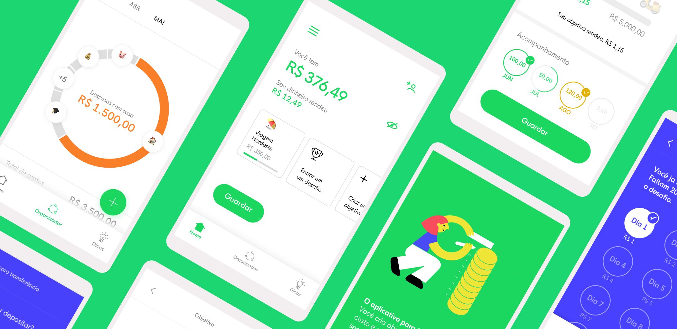
"People with goals are motivated to save money."
Diin was born with the value proposition to help Brazilians to organize themselves financially, so one of the opportunities to add value to the product would be to invest in financial education features.
Several articles about financial education suggest that people with defined goals have more chances to be motivated to save money. So the hypothesis was set. "People with goals are motivated to save money."
Secondly, we define the focus question to guide us in the final deliverable: "How can we encourage our users to save money and provide awareness of their progress?"
We are an early-stage company, our goal was to increase the number of customers and engage them in their mission of saving money, consequently increasing the added value of the app.
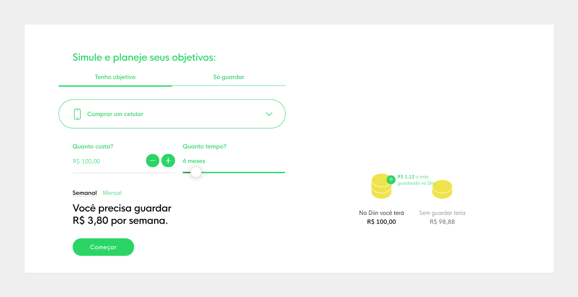
Analyzing the heatmap and the data of navigation, the session of income simulations has evidence and insights to build our feature.
Focus Question
"How can we encourage our users to save money and provide awareness of their progress?"
"How can we encourage our users to save money and provide awareness of their progress?"
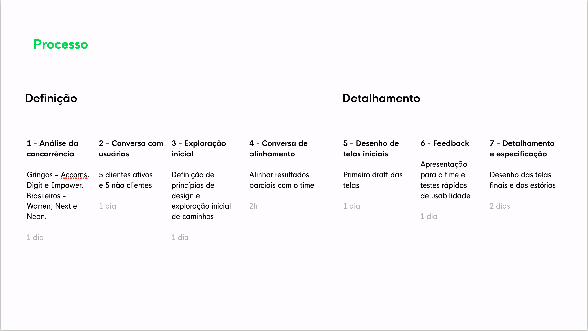
Planing the sprint
Based on the definition of our hypothesis, the sprint was planned covering tools and resources to discover and deliver our feature.
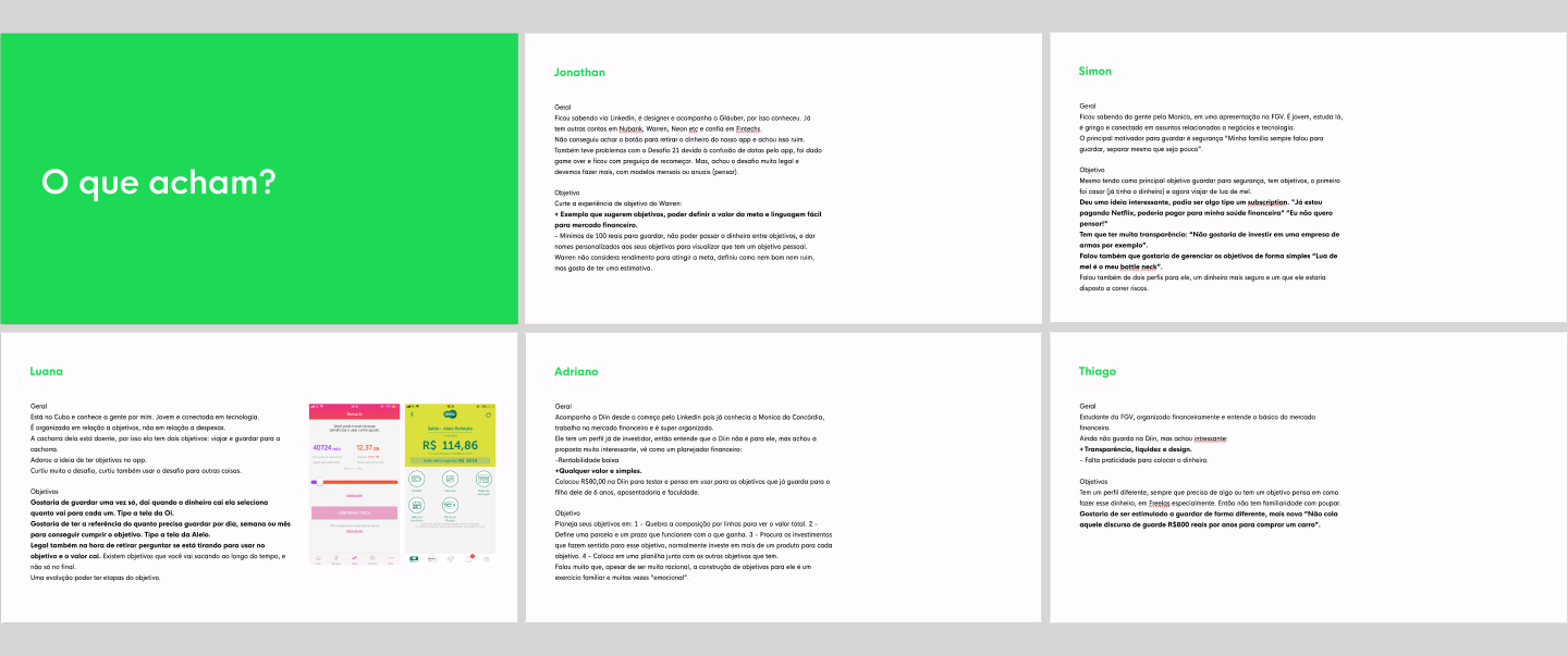
User Interviews
The idea behind quality interviews is to detect and explore some behaviors of our users. Understanding the mental models of how they organize to achieve a financial goal. After the interview, we showed them the concept of the "Objetivos" to capture the acceptance of the idea.
Some Insights:
• Desire to be encouraged to save money
• Transparency in the evolution of income
• Preference for simple investments
• Most of the interviewees have short-term goals
Desktop Research
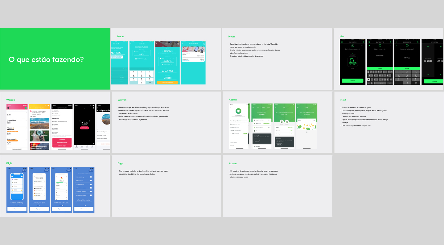
Our desktop research aimed to identify the market's most effective and user-friendly money-saving apps, specifically focusing on features such as budget tracking, savings goals, and comparison tools.
Personas
After the process of user interviews and benchmarking, creating personas was essential in the process to exercise empathy and connect with our users.
Three personas were created based on our research and analyzing the data profile.

Design Principles
We felt a need to create some design principles to north our decisions about our platform. They are:
1. Be simple and light
2. Embrace those who want something and those who just want to keep it.
3. Give an overview of the objectives.
4. Do the "boring" work by the user.
5. Turn on the guard with the financial situation.
6. Keep the dialogue alive throughout the experience.
Defining the flow
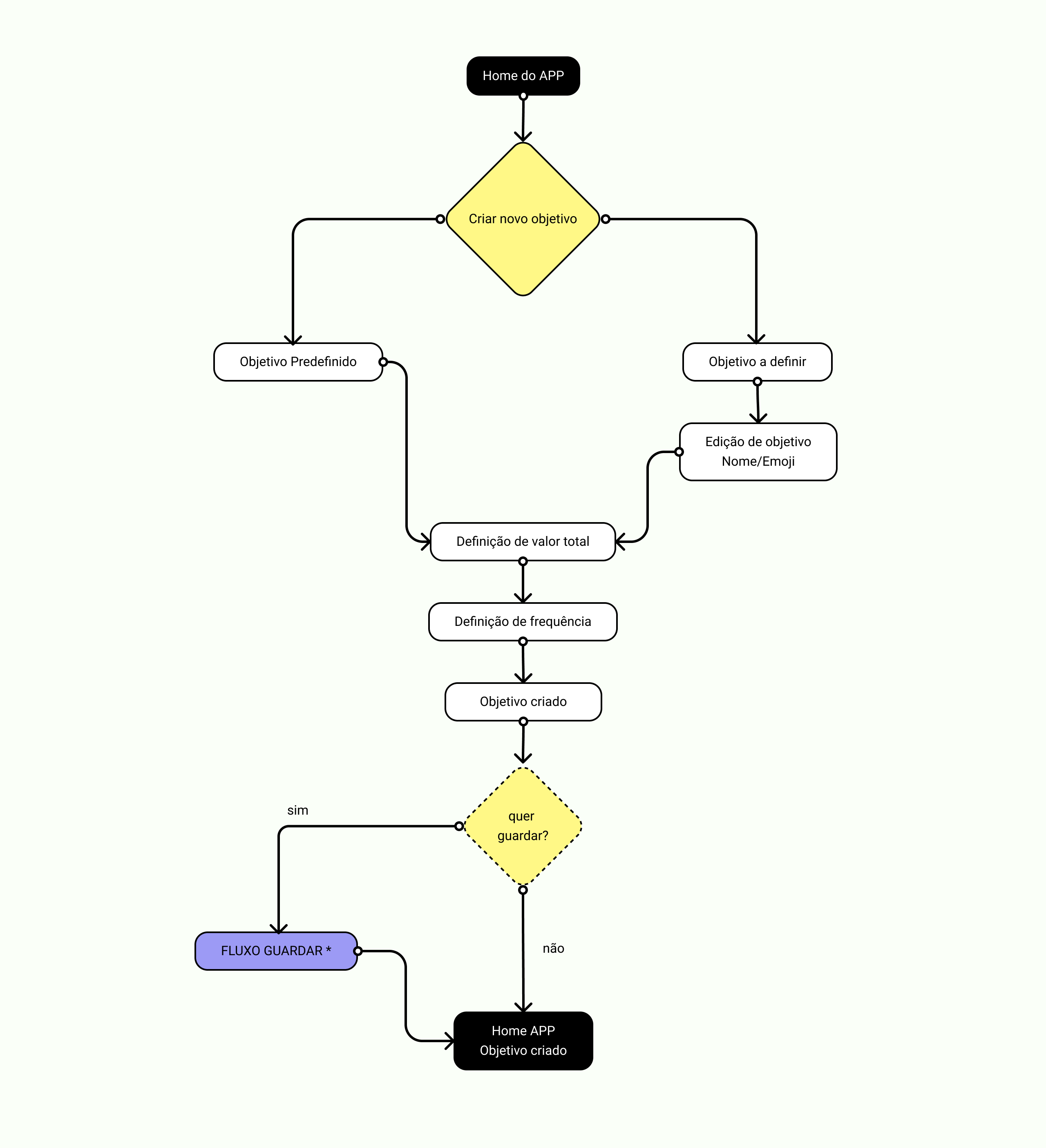
After establishing our design principles and analyzing the insights gathered during the research phase, I utilized a user-centered approach to create a streamlined flow for our feature. By simplifying the task and reducing the number of steps required, the user can easily understand the feature and begin saving money immediately.
User Testings
and the final designs
After designing and internally validating the flow, some important points were approved in tests with users:
• New menu structure, we introduced the bottom menu and for the main product features to be in evidence.
• The intuitive way to suggest the frequency x value
• Number of Steps and intuitiveness to create a goal
Measuring
the results
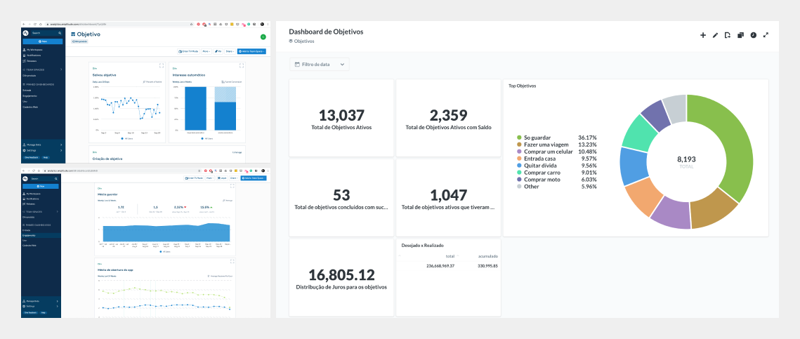
We mapped the entire flow to understand the drop-off points during the process, the types of goals created, the type of handoff, and the frequencies chosen. Much of this data was essential for the evolution of the feature.
We defined some success factors, such as transferring after the creation of the goals.
On the first day of the feature, we had 128 goals created for a base of 2,311 customers.
The feature was so successful that it became the first white-label product of the company.
Iterating the feature
After a period with the first version implemented, we collected some data that helped in iteration and found the evolution of the feature. Some points improved:
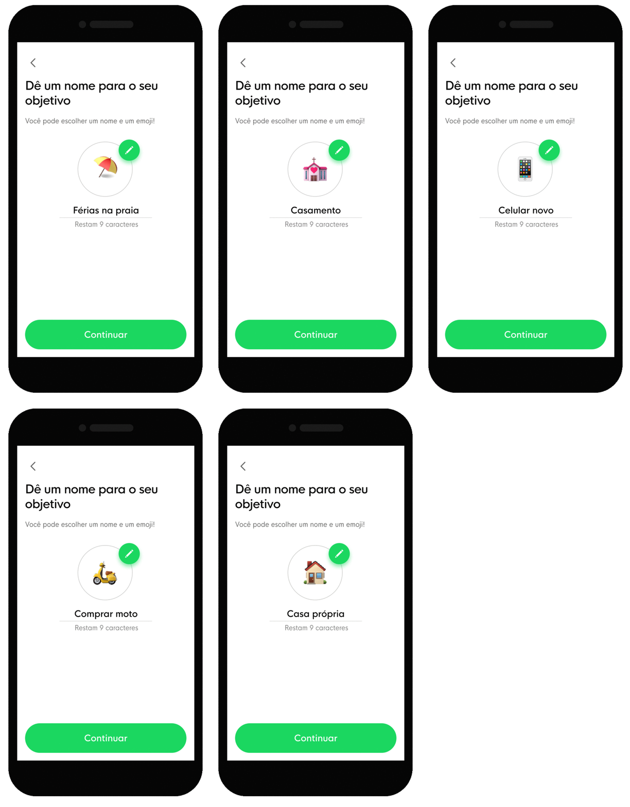
• Through data, we collected the most created names for goals and increased the suggestion page " Create a Goal "
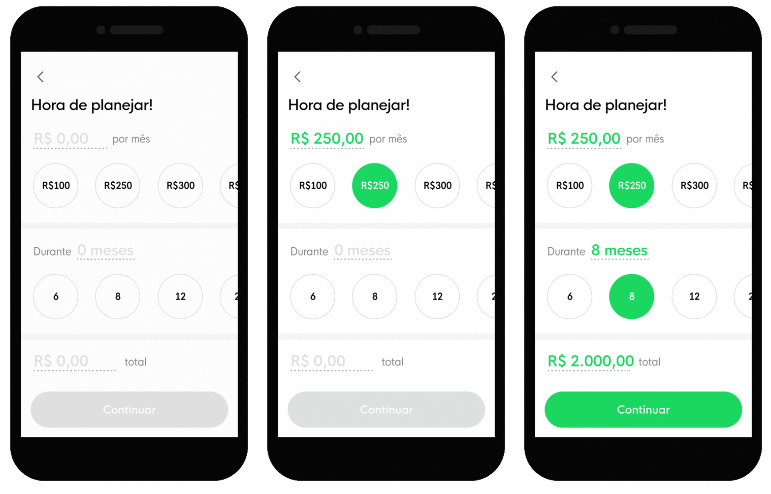
• We tested suggesting prefixed values for choosing the amount to save and the number of months to reach the goal, and the result was very positive. More than 60% of the people who created goals opted for pre-set values rather than editing a value.
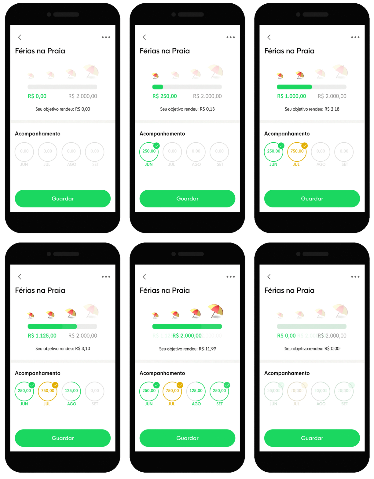
• With the experience of another feature, called "Challenge 21", we improved the visualization of the evolution of the goal, creating a tracking area of deposits made in the period and a more visual evolution scale to bring clarity if the goal of the month to save was reached.
Learnings
Working in a dynamic environment requires agility, planning, and constant alignment, but when we encounter barriers that impact the execution of the schedule, we must adapt and carry forward subsequent execution learnings that help us better estimate the time of the proposed tasks.
Dividing the execution in the deliveries of a complex feature can help the team to gain speed and consistency at the end of the process.

Chat OLX on ZAP+ PlanProduct Design
Alva LabsProject type
Nike - Talent AquisitionProject type
Give2meProject type

Fundação Dom CabralProject type

VitaconProject type
