Objetivos (Goals)
Overview
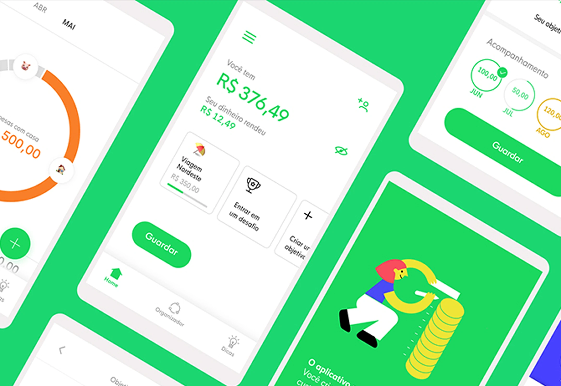
Diin is a micro-investment platform with the mission of turning Brazilians into savers. The idea is simple: you don’t need to understand the complexities of the financial market, just save your money and watch it grow.
As Product Designer, I played an active role across the entire cycle, from discovery to delivery, helping to define metrics and analyze platform performance. One of the features I developed end-to-end was “Objetivos” (Goals). Throughout the process, I ran surveys to validate hypotheses and turned those learnings into design decisions, arriving at a version that truly captured the product’s vision and objectives.
Details
Role: Sr. Product Designer
Focus: Planning, Research, Facilitation, UI/UX, Metrics
Outcome
“People with defined goals are motivated to save money.”
Diin was born with the value proposition of helping Brazilians organize themselves financially. Investing in financial education was, therefore, a clear opportunity to add value to the product.
Several articles on financial education point out that people with defined goals are more likely to stay motivated to save. This evidence gave rise to our core hypothesis.
From there, we defined the focus question that would guide development:
“How can we encourage our users to save money and give them visibility into their progress?”
Ideation
Sprint planning
With the sprint planned, we facilitated a workshop with the design and product team to align hypotheses and define the tools and resources needed to discover and deliver the feature.
User interviews
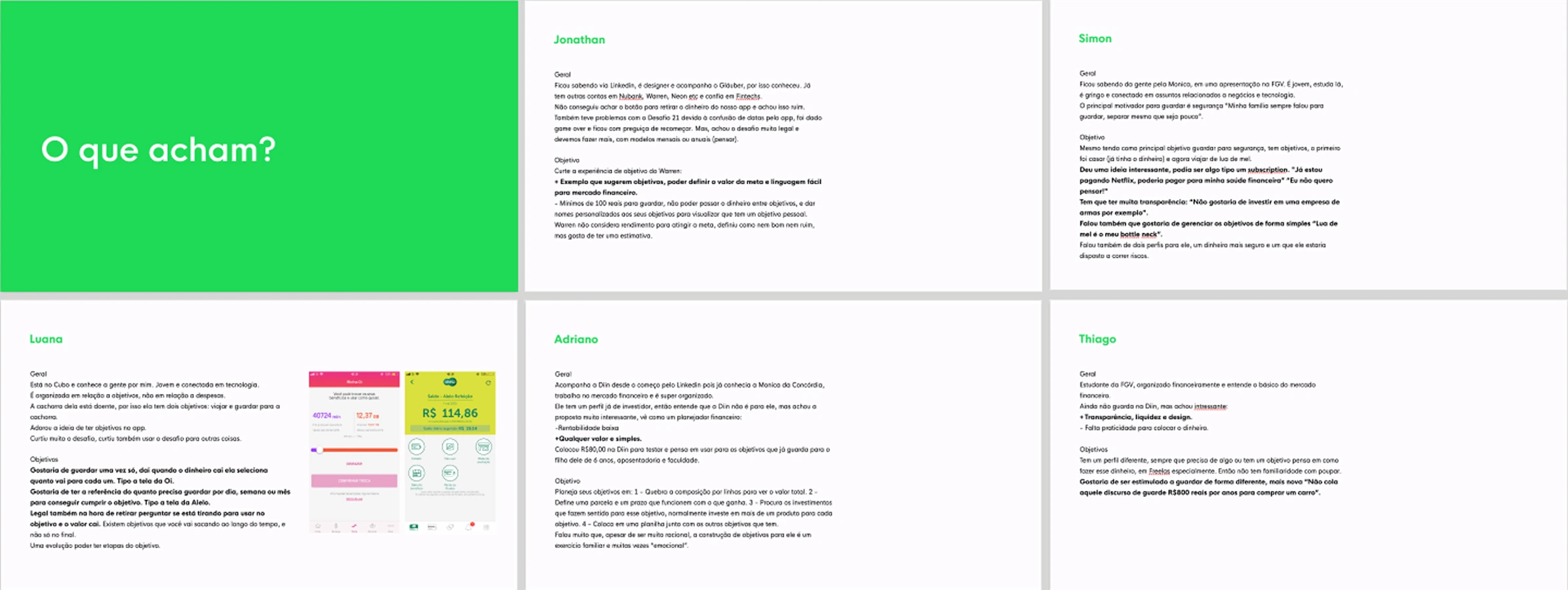
The goal was to understand behaviors and mental models: how people organize themselves to reach a financial goal. At the end of each interview, we presented the “Objetivos” concept to gauge the level of acceptance.
Key insights
- Broke from savings account to a specific goal
- Need for transparency, in how money evolves
- Preference for simple investments
- Miscellaneous vs. short-term goals
Desktop research
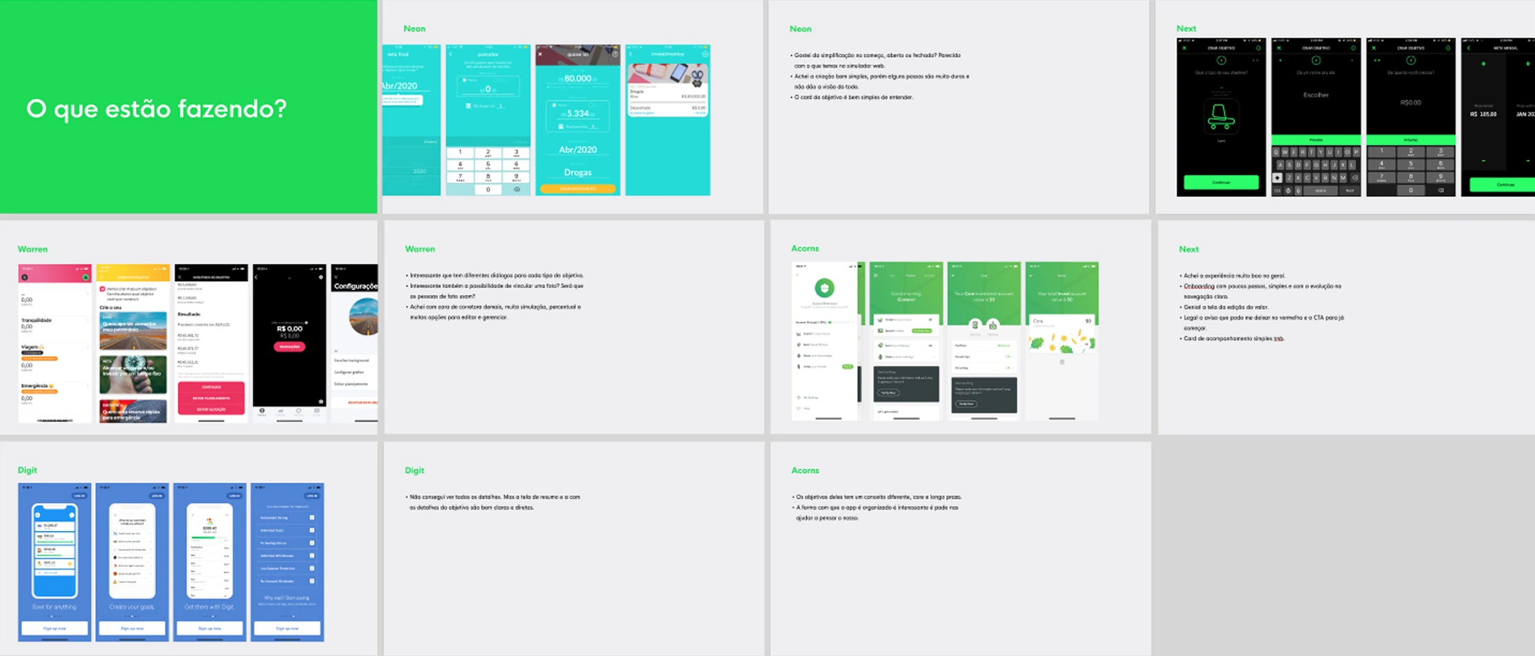
We analyzed the most effective and user-friendly savings apps on the market, focusing on features such as budget tracking, saving goals, and comparison tools.
Personas
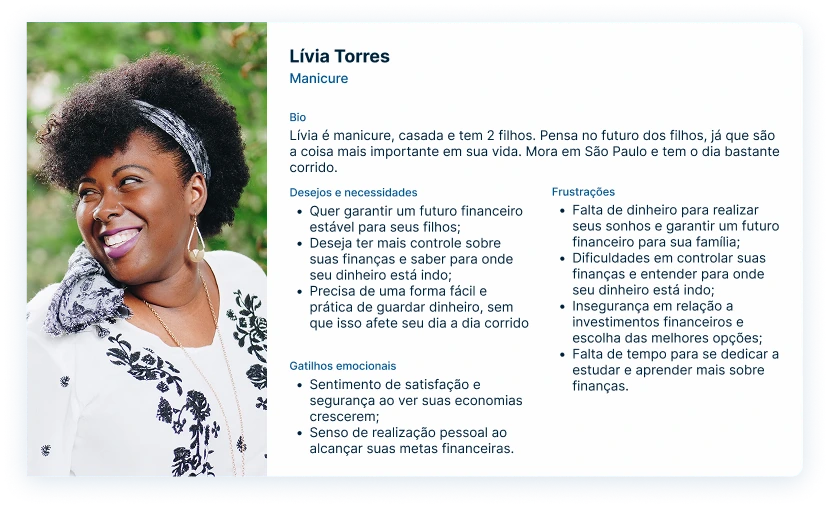
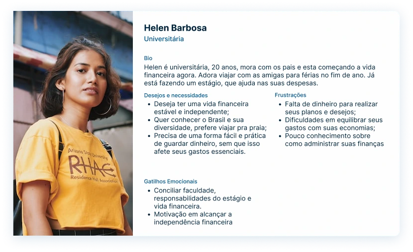
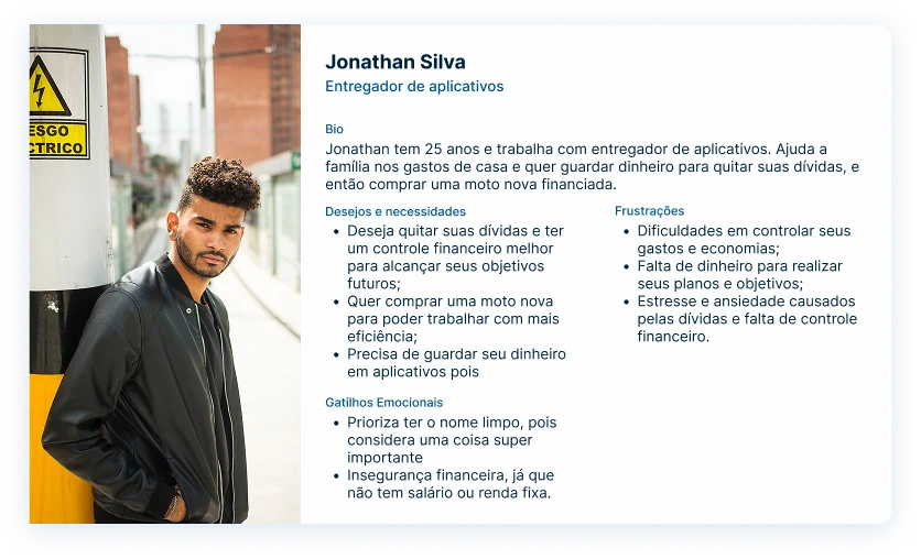
Based on the interviews and benchmarking, we built three personas grounded in the profile data we collected, an essential exercise to build empathy and stay connected to the user throughout the process.
Design Principles
We felt the need to establish principles to guide the product’s decisions:
- Be simple and light
- Welcome both those who want something specific and those who just want to save
- Give an overview of the goals
- Do the “boring” work for the user
- Raise awareness about the user’s financial situation
- Keep the dialogue alive throughout the experience
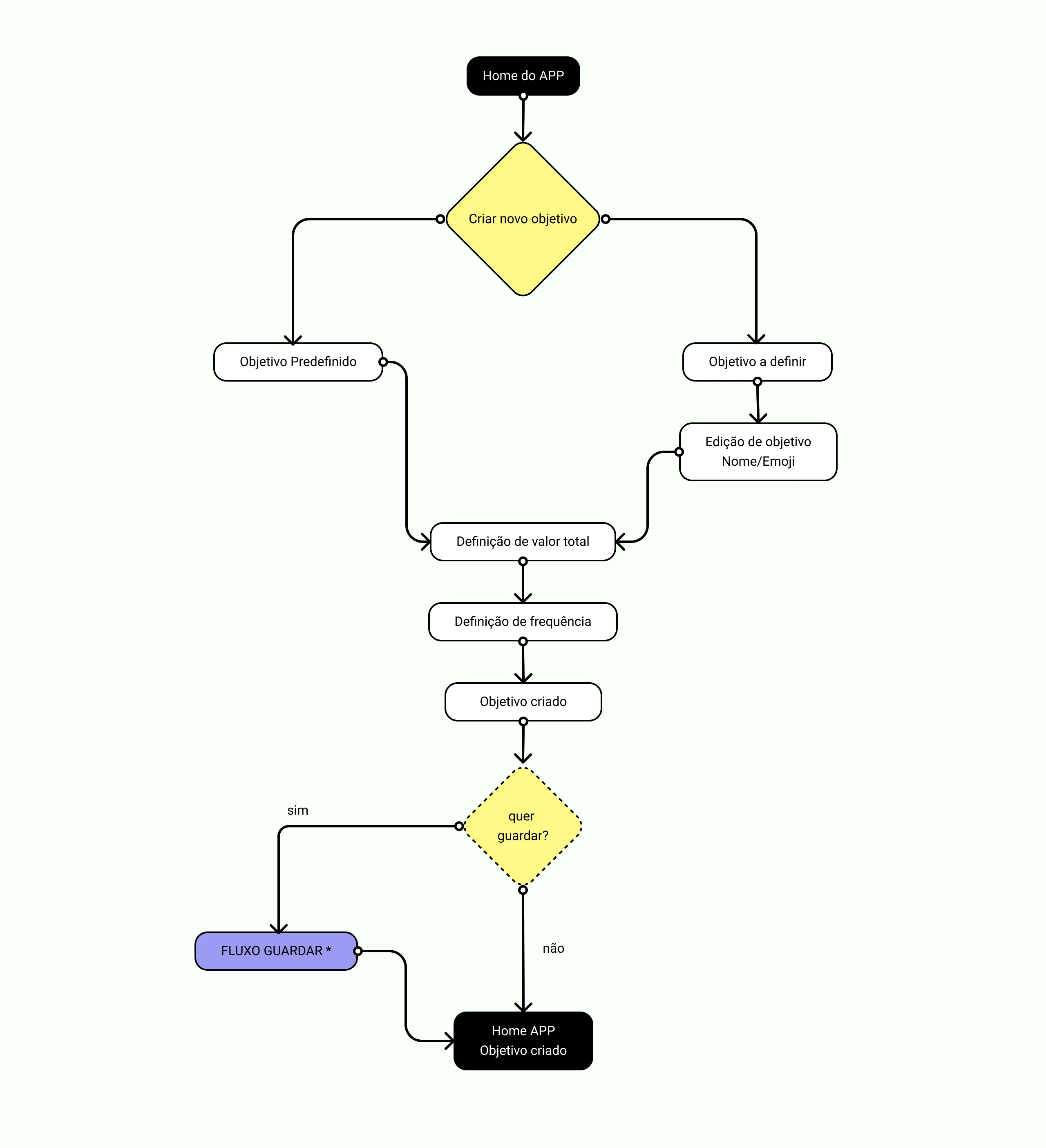
Defining the flow
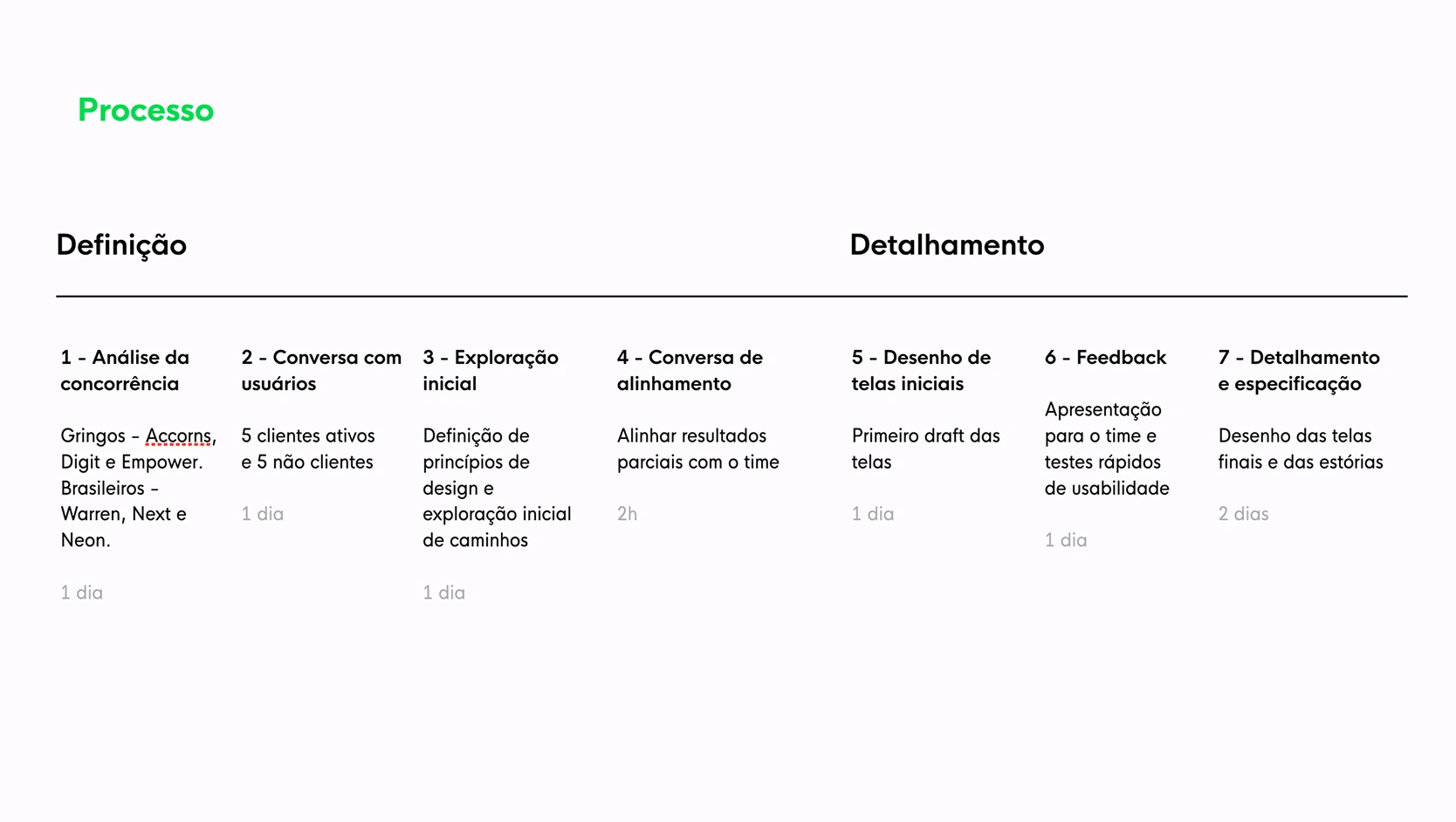
With the principles established, we planned a sprint covering the tools and resources needed to discover and deliver the feature.
Solution
After the flow was designed and internally validated, user testing confirmed key points that shaped the final version:
- New menu structure: introduced the bottom navigation menu, giving prominence to the product’s core features
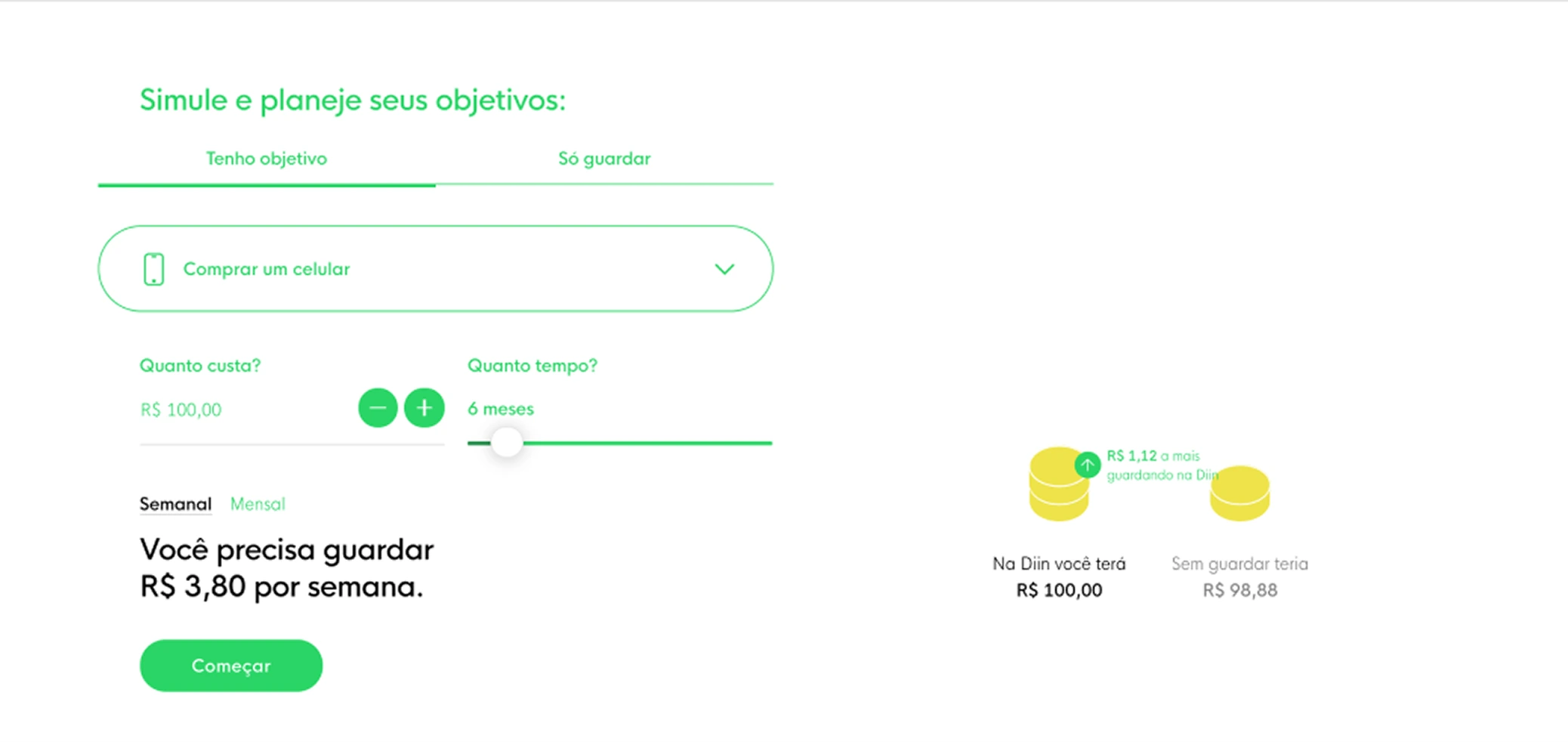
- Intuitive frequency x amount suggestion: making it easier to decide how much and how often to save
- Reduced number of steps: a lean, intuitive flow for creating a goal
The result was a feature that combined simplicity of use with clarity of purpose, allowing users to quickly create a goal and track their progress transparently.
Impact
We mapped the entire flow to understand drop-off points, the types of goals created, transfer methods, and chosen frequencies. This data was essential for the feature’s ongoing evolution. One of the key success factors we defined was transferring money right after goal creation.
Iterating the feature
With data collected over time, we evolved the feature across several fronts:
- We identified the most common goal names created by users and started suggesting them on the goal-creation page
- We tested pre-set values for savings amount and timeframe (in months) — more than 60% of users chose the suggested values instead of entering a custom one
- Drawing on learnings from another feature (“Desafio 21” / “Challenge 21”), we improved the visualization of goal progress, adding a deposit tracking area and a clearer visual scale to show whether the monthly savings goal was met
Reflection
Working in a dynamic environment demands agility, planning, and constant alignment. When we hit obstacles that impact the schedule, we need to adapt and carry those learnings forward to better estimate future timelines.
Breaking down the execution of a complex feature into smaller deliveries helped the team gain speed and consistency throughout the process — a lesson I carried into the projects that followed.